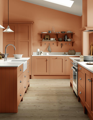

Folly Pink No.G14
from $55.00
Folly Pink is a warm terracotta shade that sits between Mortar Pink and Singed Red. It's wonderfully versatile, appearing paler and more neutral in...
View full details
Folly Pink is a warm terracotta shade that sits between Mortar Pink and Singed Red. It's wonderfully versatile, appearing paler and more neutral in...
View full details

Folly Green was inspired by – and often used in – the neoclassical interiors of the 18th century. Despite these lofty origins, this cheerful shade ...
View full details
Fawn is a classic tan colour with roots in the 18th century, when it typically would have been used on all the walls and woodwork in a room. Try th...
View full details

Entrance Hall Pink is a muted warm pink with a great deal of yellow pigment, its warmer tones setting it apart from fellow Archive colour Ointment ...
View full details

The first cream to feature in the Farrow & Ball palette is aptly named after the brand's co-founder, John Farrow. A classic wall colour, with n...
View full details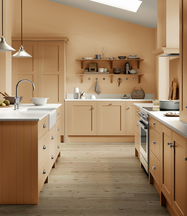

The tongue-in-cheek name of this archived Farrow & Ball colour instantly conjures up its cheerful, warming tones. Far from the luminous shade y...
View full details

Faded Terracotta. As its name suggests, it mimics the colour of sun-baked terracotta to create a light but warm shade that flatters any room.

Inspired by an ancient civilisation, this earthy red is less intense than Preference Red but still wonderfully rich.

Entrance Hall Pink is a muted warm pink with a great deal of yellow pigment, its warmer tones setting it apart from fellow Archive colour Ointment ...
View full details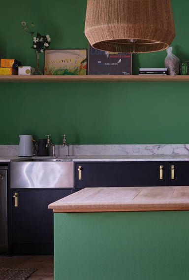

Emerald Green is a bright, upbeat colour that brings instant joy and vitality to any space. Less blue than Verdigris Green it works particularly we...
View full details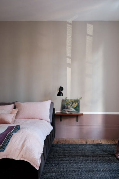

Elephant's Breath is instantly recognisable as a Farrow & Ball shade, both in name and colour. It's a universally popular mid-tone grey with a ...
View full details

The name 'Eddy' comes from the circular currents enjoyed by wild swimmers as a natural jacuzzi. Delicate without being pastel, it's a gentle green ...
View full details

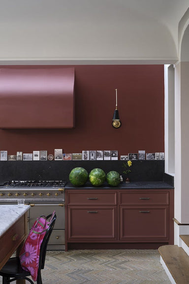
Eating Room Red is a deep, blackened burgundy shade that takes its name from the dining rooms of the mid-19th century, where damask wallpapers of t...
View full details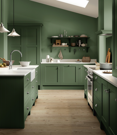

Dyrehaven is a deep and earthy green with grey undertones, taking its name from the shady woodlands of Denmark's Dyrehaven deer park. It pairs beau...
View full details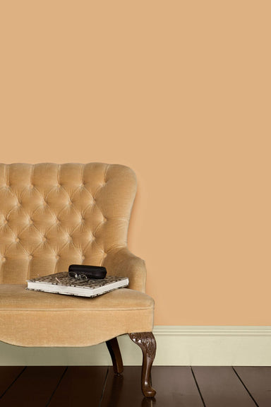

Dutch Pink is a peachy, yellow-based colour quite different from what we'd call 'pink' today. It takes its name from the yellow artists' pigment 'D...
View full details

Dutch Orange is a colour unlike any other in the Farrow & Ball palette – a warm, bright and sunny shade that appears orange to some and yellow ...
View full details

This aged yellow celebrates the ever so familiar cloth used to clean homes around the world.

Duck Green is the perfect forest green shade and a very contemporary alternative to dark greys or blues. It looks just as dashing on woodwork as it...
View full details

Drop Cloth is a mid grey beige – or 'greige' – that pays homage to our expert painters and decorators. It takes its name from the indispensable dus...
View full details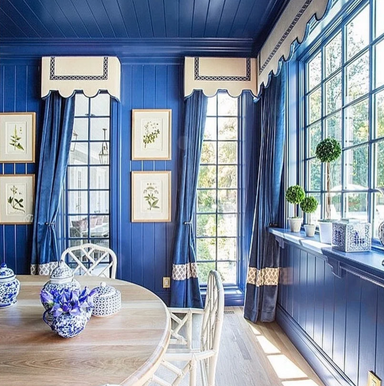

Drawing Room Blue is a welcome middle ground between two current Farrow & Ball favourites – the navy Stiffkey Blue and the more purple Pitch Bl...
View full details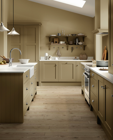

Like the warmer Dauphin, this mid-toned brown is a classic example of the elegant 'drab' tones loved by homeowners of the 18th and 19th centuries. ...
View full details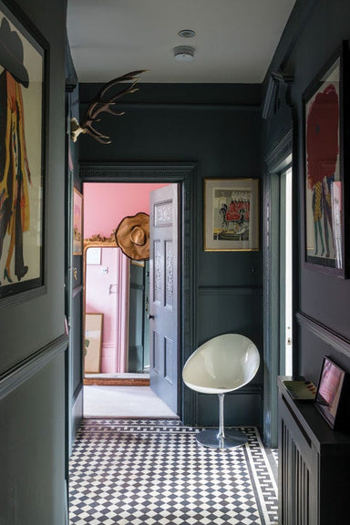

Down Pipe is a true Farrow & Ball classic. A deep lead grey with a blue undertone, it creates a strong but complex finish on all sorts of surfa...
View full details

Dove Tale is a warm mid-tone grey, perfect as a darker accent – or alternative – to Elephant's Breath. Its subtle lilac undertone gives it a soft a...
View full details

Sitting between two of the best-loved Farrow & Ball colours, Inchyra Blue and Green Smoke, this shade is reminiscent of the sooty, tarnished br...
View full details