
Scallop No. 311
from $9.00
A lighter interpretation of Dead Salmon, this soft shade is inspired by the gentle hue and curved shape of the cherished shellfish.
A lighter interpretation of Dead Salmon, this soft shade is inspired by the gentle hue and curved shape of the cherished shellfish.

Saxon Green is a green quite unlike any in Farrow & Ball's current palette. It is a soft, yellow-toned mid green with a comforting traditional ...
View full details

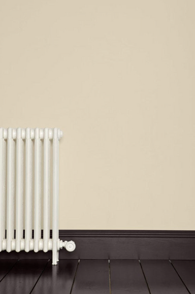
As with other Farrow & Ball paint colours containing the word 'ground', this stony yellow-based neutral was originally used to create the compa...
View full details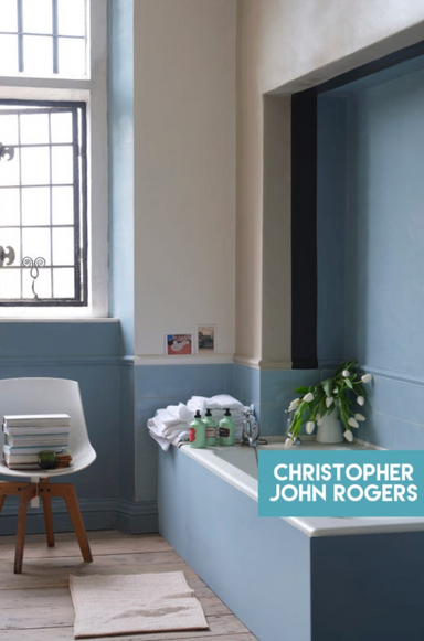

A silvery, muted blue, Sardine takes its name from the favourite afternoon snack of a much loved grandfather. Laid-back and welcoming, pair it with...
View full details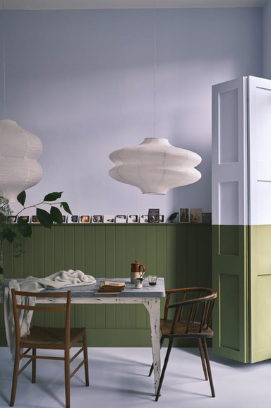

Irresistibly enticing, this olive shade is a true celebration of nature. It becomes wonderfully intense when used in small spaces.
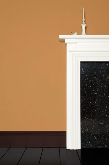

A deep, rich and warm caramel with red undertones, Sand is a superb candidate for small spaces and low-lit rooms, but it can create an inviting and...
View full details

Archive Collection: Salt. It's a crisp white with the slightest hint of grey.
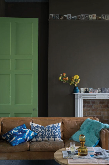

Far from a bad thing in colourists' terms, 'drab' simply describes a colour lacking in brightness, like this warm and sophisticated chocolate brown...
View full details

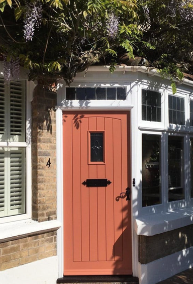
A brilliant red, Romesco is evocative of the classic Spanish sauce. Rich and lively, it also doubles as a favourite makeup shade. Try pairing it wi...
View full details

Roasted Macadamia is a soft neutral inspired by the nut of a similar shade. Versatile and effortlessly inviting, this warm shade creates cosy spaces.

Ringwold Ground is a fresh-feeling neutral that brings a subtle glowing warmth to any room. It shares the yellow base of its complementary white, T...
View full details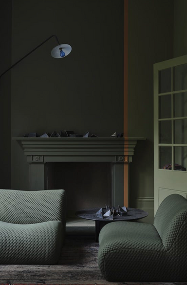

Sometimes green and sometimes brown, the green pigment in this deep neutral has been reduced so much that it's barely there.

Red Earth contains a blend of red and yellow pigments, both of which come together to create a terracotta tone of enormous warmth. It's a rich and ...
View full details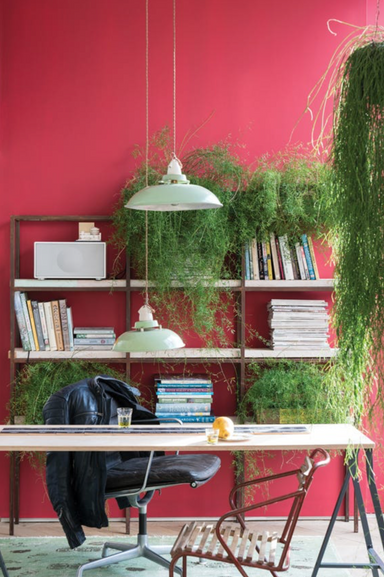

Rectory Red is a rich and traditional red with a 'blackened' tone, which gives it a gently lived-in feel. Just as at home in a modern space as in t...
View full details

Raw Tomatillo is a verdant green inspired by fried green tomatoes made by a beloved grandmother. Joyful, fresh and vibrant, it’s sure to bring a sm...
View full details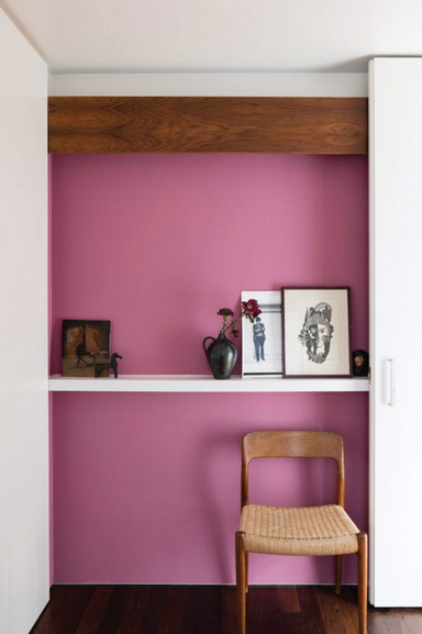

Rangwali is one of the boldest hues in the Farrow & Ball palette – an unapologetically vibrant pink inspired by the exuberant colours of the Ho...
View full details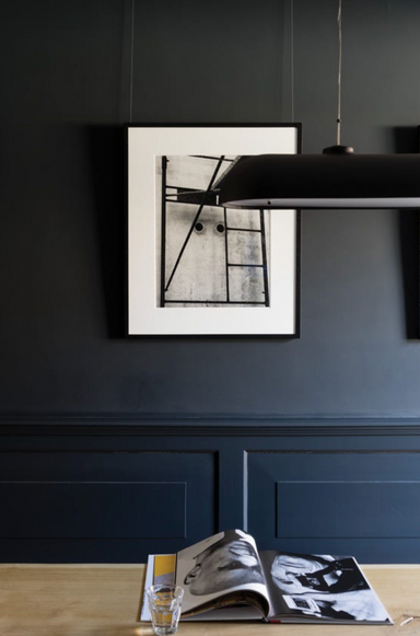

Railings is a blue-based shade of black, appearing more blue or more discernibly black depending on the light. It's a great favourite for kitchen c...
View full details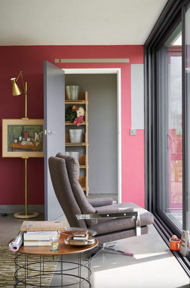

Radicchio is a very modern shade of red, with a distinct magenta undertone that gives it its contemporary feel. It creates rooms that feel vibrant ...
View full details

Purbeck Stone takes its name and colour from the Isle of Purbeck, near Farrow & Ball's home on the south coast of England. Part of the Easy Neu...
View full details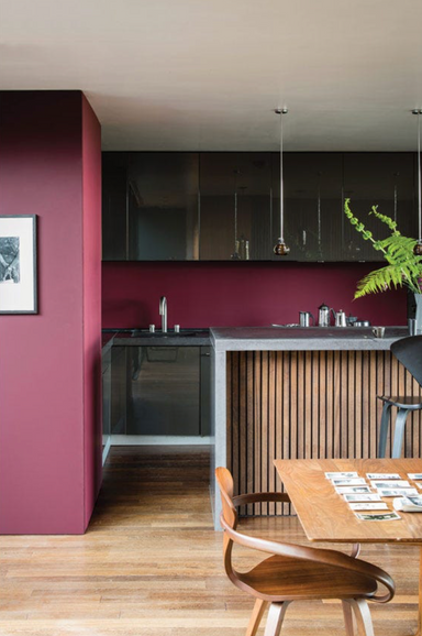

Preference Red is a traditional-feeling deep red with a nod to Farrow & Ball's past as a purveyor of 'Preference Paints'. For a more classic fe...
View full details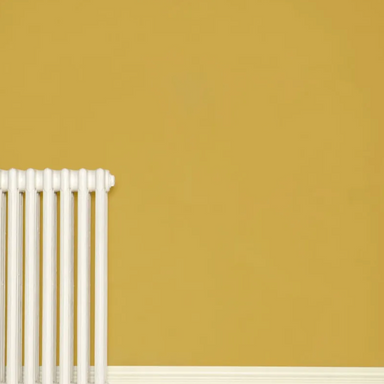

Print Room Yellow is packed with soft ochre pigments for a gentle golden glow. Less bright and sunny than Babouche and Yellow Ground, it never feel...
View full details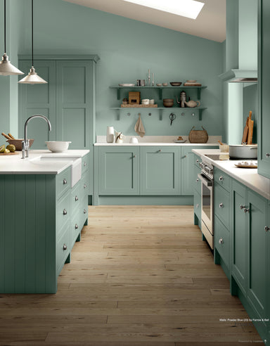

Powder Blue is a shade of light blue with an unusual amount of warmth, thanks to the inclusion of a little green pigment. Try it as a subtly deeper...
View full details

Potted Shrimp is a soft, nostalgic pink from the Farrow & Ball Archive. It's more of a classic blush shade than its fellow soft pink, Setting P...
View full details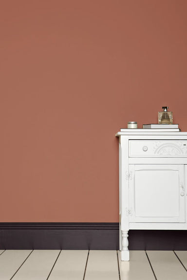

Porphyry Pink is a deep rose colour bordering on red. Popular in the Regency period, it would often be used alongside a dark red stone called porph...
View full details