
Folly Pink No.G14
from $55.00
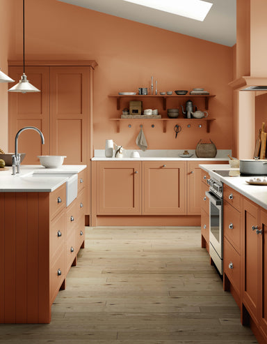
Folly Pink is a warm terracotta shade that sits between Mortar Pink and Singed Red. It's wonderfully versatile, appearing paler and more neutral in...
View full details
Folly Pink is a warm terracotta shade that sits between Mortar Pink and Singed Red. It's wonderfully versatile, appearing paler and more neutral in...
View full details

Folly Green was inspired by – and often used in – the neoclassical interiors of the 18th century. Despite these lofty origins, this cheerful shade ...
View full details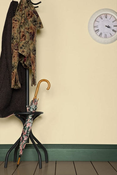
Fawn is a classic tan colour with roots in the 18th century, when it typically would have been used on all the walls and woodwork in a room. Try th...
View full details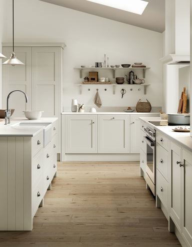

Entrance Hall Pink is a muted warm pink with a great deal of yellow pigment, its warmer tones setting it apart from fellow Archive colour Ointment ...
View full details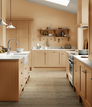

The tongue-in-cheek name of this archived Farrow & Ball colour instantly conjures up its cheerful, warming tones. Far from the luminous shade y...
View full details

Faded Terracotta. As its name suggests, it mimics the colour of sun-baked terracotta to create a light but warm shade that flatters any room.

Entrance Hall Pink is a muted warm pink with a great deal of yellow pigment, its warmer tones setting it apart from fellow Archive colour Ointment ...
View full details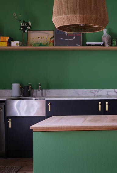

Emerald Green is a bright, upbeat colour that brings instant joy and vitality to any space. Less blue than Verdigris Green it works particularly we...
View full details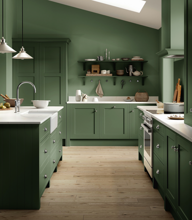

Dyrehaven is a deep and earthy green with grey undertones, taking its name from the shady woodlands of Denmark's Dyrehaven deer park. It pairs beau...
View full details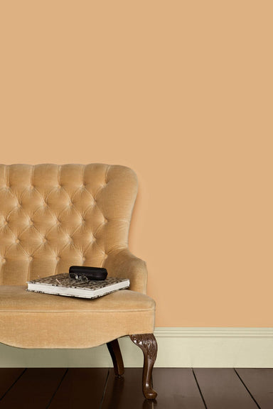

Dutch Pink is a peachy, yellow-based colour quite different from what we'd call 'pink' today. It takes its name from the yellow artists' pigment 'D...
View full details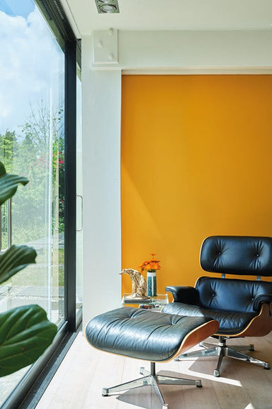

Dutch Orange is a colour unlike any other in the Farrow & Ball palette – a warm, bright and sunny shade that appears orange to some and yellow ...
View full details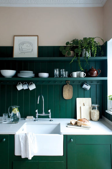

Duck Green is the perfect forest green shade and a very contemporary alternative to dark greys or blues. It looks just as dashing on woodwork as it...
View full details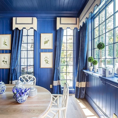

Drawing Room Blue is a welcome middle ground between two current Farrow & Ball favourites – the navy Stiffkey Blue and the more purple Pitch Bl...
View full details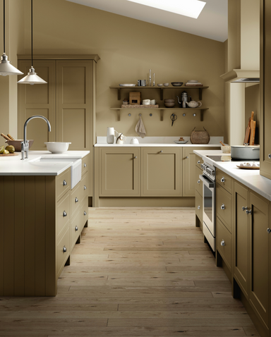

Like the warmer Dauphin, this mid-toned brown is a classic example of the elegant 'drab' tones loved by homeowners of the 18th and 19th centuries. ...
View full details

Double Cream is a warm, light neutral. It has noticeable peachy tones that set it apart from the classic Farrow's Cream, which appears fresher, lig...
View full details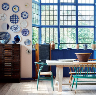

Dinnerware takes its name from the intricate patterns popularly used on china in the 18th century. Designs would often pair this lively shade of bl...
View full details

Deep Reddish Brown's appeal is right there in the name – this intensely rich, warm russet was once very popular as a woodwork colour in country hou...
View full details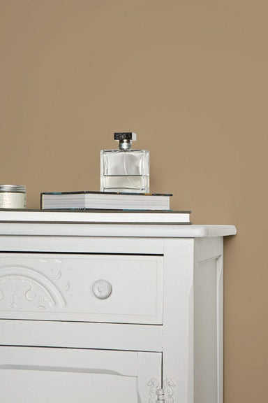

Dauphin is a warm mid-toned brown. Like Farrow & Ball's Salon Drab, it's inspired by 19th-century interiors, in which these 'drab' shades – ori...
View full details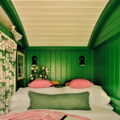

Danish Lawn is a clear, vibrant green that feels as fresh as a just-cut lawn. To really embrace Danish Lawn's boldness, pair with a colour that mat...
View full details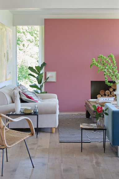

Rather than the intense shade its name suggests, Crimson Red is a unique shade of pink – as modern and romantic as Sulking Room Pink but with a gre...
View full details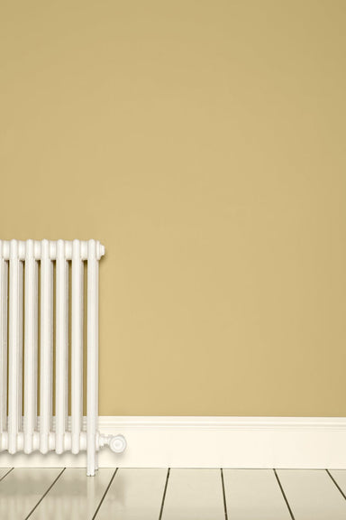

Quite simply the perfect shade of cream. This classic off-white is less fresh and bright than Farrow's Cream, having a subtle hint of black pigment...
View full details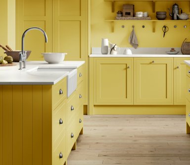

Coppice Blue was originally an exterior woodwork colour, a feature of Snowshill Manor in Gloucestershire for over a century. Today, its rich teal t...
View full details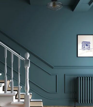

Coppice Blue was originally an exterior woodwork colour, a feature of Snowshill Manor in Gloucestershire for over a century. Today, its rich teal t...
View full details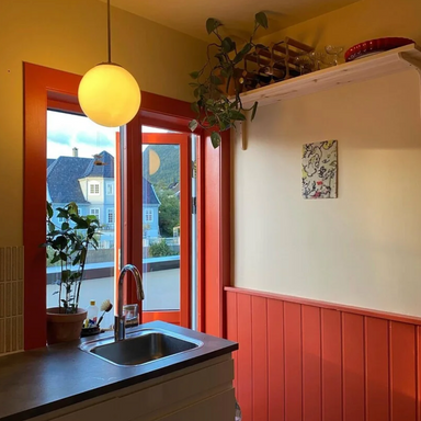

A strong brick red, Copenhagen Roof is reminiscent of the tiled roofs of the Danish capital's old gabled townhouses. Try it with trim painted in a ...
View full details